
Problem
When regulations were put in place due to the onset of COVID-19, HRSA was put in a position where they had to get Telehealth.hhs.gov up ASAP in order to comply with government regulations. However, a time crunch like that does not lend itself time for strategizing content and that’s where Phase2 was able to come in and make impactful adjustments.
Context
Health Resources & Services Administration (HRSA) may have been forced to create Telehealth.hhs.gov because of the restrictions of COVID-19, but this great disruption has set the new standard on how to get or provide remote healthcare services.
Telehealth services saw a 50% increase in Q1 2020. In addition, the number of insurance claim lines that featured telehealth services increased by more than 5,000% from May 2019 to May 2020. It’s clear that telehealth, while certainly propelled by COVID-19, is becoming a more and more popular choice for both patients and medical providers.
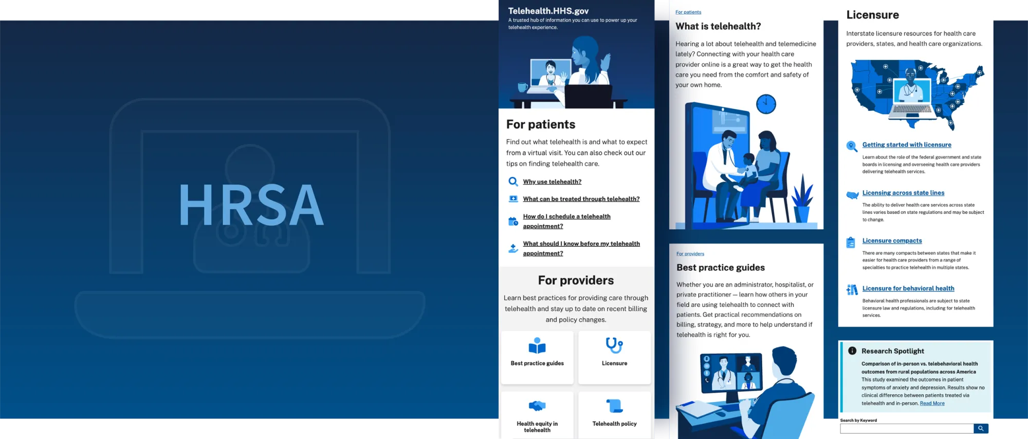
To continue to make telehealth services more accessible, HHS & HRSA created a central resource and repository of information, Telehealth.hhs.gov, to assist both individuals seeking telehealth services and healthcare providers who are (or plan to) deliver care virtually.
Health Resources & Services Administration (HRSA) may have been forced to create Telehealth.hhs.gov because of the restrictions of COVID-19, but this great disruption has set the new standard on how to get or provide remote healthcare services.
Our approach
A content assessment was conducted and found that there was a disjointed user journey and content gaps to fill. User testing showed major pain points users were experiencing on the site that could be solved by implementing a foundation of user journeys and intents. Small changes made a big impact in helping providers understand how to use telehealth technology, what was allowed in this digital setting, and how to make patients feel comfortable throughout the experience.
Small UX Changes Create Big Impacts
As part of the UX design improvements, an expert review revealed recommendations including both quick fixes to ensure compliance with the U.S. Design web systems (USDWS) and longer-term redesign proposals to improve standards and consistency across the website. For example, adding iconography with links to chunk information to make it more digestible for users greatly improved the usability of the page. As content was continually developed, UX recommendations and improvements were made to create new page design templates. With these templates content writers were able to publish new content faster while still complying with the USDWS.